
Barnes & Noble nook App:
UI Redesign
Nov 08-10, 2022 - solo project
This was my first time working alone on a project and I was both nervous and excited. When I heard the brief (three days to redesign the UI of an existing, popular app) I immediately knew what I wanted to do: create a spine-first view for a book reading application.
I’ve had e-readers since 2005 and for many years I owned a nook. Now back in France, I ended up changing e-readers as B&N doesn’t exist here, and as a result, I lost access to my existing library, at least for any e-ink device. To access the many books I own from B&N, I need to use their mobile or tablet app.
In real life, we see books spine-first a majority of the time, whether it’s on our own bookshelves, in a library, or in a bookstore. I wanted to recreate the feeling of picking up a book from a shelf and examining it, so I decided the majority of my three days would be spent creating an animation to do so.
Screen Clones
I started with some mockups of the existing app to get a feel of the design choices. I felt the home screen and an author page would be good starting points, and also cloned the profile screen which seemed barebones to me.

This was fairly straightforward but it gave me the opportunity to get familiar with the design and the existing heuristics. I realised for instance there was no way to sort books by series, which I feel would be pretty useful. On the profile page, I also noticed a “Buy Passcode” option which confused me: why should I buy a passcode? What for? It turned out that this option allows you to enable or disable password verification for purchases. I decided I would make it clearer in my redesign.
Visual Analysis and Style decisions
A visual analysis of the app’s competitors showed they all had a very simple interface with neutral colours to emphasize the covers as the main draw. This was important for me to keep. None of them features visuals for the spine or back cover, which confirmed that it would stand out in my redesign.
Moodboard
For my mood board, I wanted to recreate the feeling of coziness, comfort, and dreaminess that comes from reading. I then decided to keep the blue colour chart, but to add a hint of green/nature in the profile page, which I meant to make the most “homey”. Also for the profile page, I decided to introduce a new font, Mansalva, for its “fun” feel and to make the profile page feel more like a personal space. For the rest of the design, I kept a similar font to the original app (in this case Lunchtype21).
Redesigned wireframes

The homepage changed the least: I wanted to keep the option of seeing the front covers as it is familiar to most people, but I also wanted a homogeneous feel between the different screens, therefore I added shelves under the covers, where I placed the authors’ names. The rest was left unchanged.

For the Author page, I moved the name of the author to the header, which felt empty, and added the rest of the menu as well. I used shorter shelves as they didn’t need to accommodate any text.

The profile page underwent much bigger changes. I added the different user profiles as portraits on a wall with their own nameplates, and the top shelf for the various options. I also added a plant for more homeyness and replaced the “Purchase Passcode” option with an on/off button that seemed more intuitive to me. For the child version of the page, I removed the button and the “Sign Out” option to prevent misclicks. I plan on adding a toy or picture that the child could choose to replace the on/off button as I feel the wall and shelf look a bit empty.
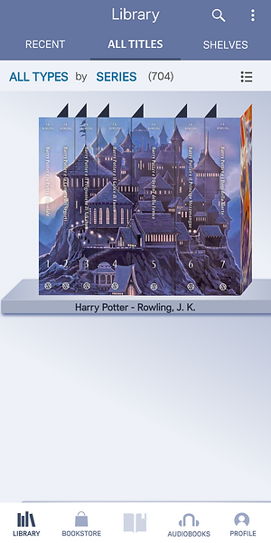
Finally, I added a view that would be per series and also showcases the “spine view” feature. I chose the Harry Potter series as its seven books allowed me to really showcase the feature. Plus, the “Castle Edition” with covers by Kazu Kibuishi is absolutely beautiful and I wanted to show off the wonderful art. Here is a video of the feature in action:
Next Steps
First of all, I plan on adding pages to the top of the shelved books so that they look more real and “full”. Then, I will add a feature to drag the screen and look at the back cover, which I always look at when deciding which book to purchase or read. The rest will be about adapting the design: some of the icons, as well as the header, are a bit too small for ideal use. This was beyond the scope of this three-day project, but the project was a great, challenging opportunity and I plan to continue working on it, so stay tuned for Part 2!